
A Mobile Ready Website is a Must-Have!
 In today’s world, smartphones and tablets have become ubiquitous. With everyone always on the go, dismissing mobile marketing could be a fatal mistake for any business. Data that shows that having a mobile-ready website is no longer optional.
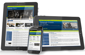
We specialize in creating websites that are not only mobile-ready but also responsive. This means that your website will adapt to any device or browser it is viewed on, providing an optimal user experience. The site will load quickly and be easily navigable on cell phones, tablets, and notebook computers across all operating systems.
Check out a few examples of responsive websites we’ve designed. We recommend viewing them on both your phone and laptop/desktop to see how they adjust to different screen sizes:
- North Carolina Muscadine Grape Association – Pittsboro, NC
- Gym Floor Finishes | Hardwood Floor Coatings by Advantage Coatings Technologies
- Four Seasons Heating & Cooling, Ltd. – Las Cruces, New Mexico
- Hardwood Floor Finishes by Advantage Coatings Technology
- Emerald Isle Boutique – Mesilla, NM
- Rio Grande Theatre – Las Cruces, NM
Additionally, we’ve included several layout demos below that showcase the effectiveness of the tools we use in transforming page layouts to look best on all devices, from smartphones to large screens. Again, we recommend checking them out on both your phone and laptop/desktop: